Analyzing the US Masters 2020 1-Hour ePostal Results
Every year US Masters Swimming runs an event called the 1 Hour ePostal. Rules are simple - athletes swim as many lengths of a 25 yard (or longer) swimming pool as possible in one hour, during the month of February, and without the aid of equipment beyond a legal suit and goggles. Total distances can then be submitted electronically (hence the “e”). The athlete who covers the longest distance in each age/gender group is National Champion. Some people are specifically competing for that title, and perhaps shooting for associated national records. Others are just out to push themselves, to have a good time, or maybe just to get out the house.
In any case, the ePostal results are an interesting read. They’re posted here as .pdf files. The first step is to wrestle the .pdf into a data frame.
I’m going to use a modified version of the Read_Results and Swim_Parse functions from the latest development version of my SwimmeR package. While it’s perhaps the most technically interesting (or at least involved) portion of this work, the function is also several hundred lines long. I won’t reproduce it in this blog post, but it, and all the other data discussed below, is available on github. I’ll start instead with data I’ve already read in.
library(tidyverse)
library(viridis)


urlfile <- "https://raw.githubusercontent.com/gpilgrim2670/Pilgrim_Data/master/Postal_2020.csv"

df_2020 <- read_csv(url(urlfile))

head(df_2020)
## # A tibble: 6 x 9
## Place Name Age Club Distance USMS_ID Gender Year National_Record
## <dbl> <chr> <dbl> <chr> <dbl> <chr> <chr> <dbl> <chr>
## 1 1 Jason Weis 24 NEM 4550 0202-0B9VP M 2020 N
## 2 2 Ryan Williamson 19 1776 4095 080H-J70XX M 2020 N
## 3 1 Ryan Waddington 29 DAM 5240 3805-HFD68 M 2020 N
## 4 2 Austin Teunissen 25 AQST 5125 520H-KKRMH M 2020 N
## 5 3 Andrew Barmann 27 CVMM 5070 330S-NDTX9 M 2020 N
## 6 4 Mitchell Victoria 26 CRUZ 4870 3800-0AJ9E M 2020 NUSMS divides athletes into age groups five years wide with the exception of the first. Athletes ages 18-24 are one age group, athletes 25-29 are another and so forth. Let’s add age groups to the data frame.
df_2020 <- df_2020 %>%
      mutate(Age_Group = case_when(
      Age <= 24 ~ "18-24",
      Age > 24 & Age < 30 ~ "25-29",
      Age > 29 & Age < 35 ~ "30-34",
      Age > 34 & Age < 40 ~ "35-39",
      Age > 39 & Age < 45 ~ "40-44",
      Age > 44 & Age < 50 ~ "45-49",
      Age > 49 & Age < 55 ~ "50-54",
      Age > 54 & Age < 60 ~ "55-59",
      Age > 59 & Age < 65 ~ "60-64",
      Age > 64 & Age < 70 ~ "65-69",
      Age > 69 & Age < 75 ~ "70-74",
      Age > 74 & Age < 80 ~ "75-79",
      Age > 79 & Age < 85 ~ "80-84",
      Age > 84 & Age < 90 ~ "85-89",
      Age > 89 & Age < 95 ~ "90-94",
      Age > 94 & Age < 100 ~ "95-99",
      Age > 99 & Age < 105 ~ "100-104"
    ))
Now that we’ve got my data the way we want it let’s do some quick stats and plots just to get a feel for it.
Every USMS athlete has a unique identifying number, stored under the USMS_ID variable. Let’s see how many athletes participated.
length(unique(df_2020$USMS_ID))## [1] 970A total of 970 people swam more or less continuously for one hour in the month of February 2020 and then submitted their times. Not too shabby!
Let’s look at how those athletes are distributed by age group and gender.
df_2020 %>%
  group_by(Age_Group, Gender) %>%
  summarise(`No. of athletes` = n()) %>%
  ggplot(aes(x = Age_Group, y = `No. of athletes`, fill = Gender)) +
  geom_bar(stat = "identity", position = "dodge") +
  scale_fill_viridis(discrete = TRUE) +
  labs(x = "Age Group") +
  theme_bw() +
  theme(axis.text.x  = element_text(angle = 45, vjust = 0.5))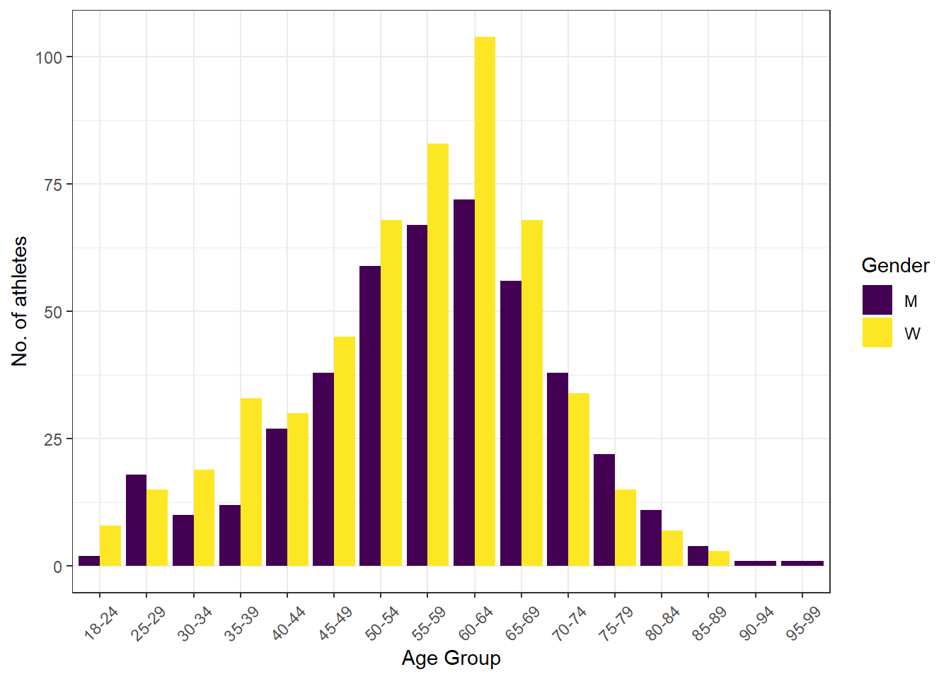
So significantly more women participated up until the 70-74 age group, then more participants were men, including the two oldest age groups represented, where all the participants were men. Not what I would have expected based on general life expectancy data - an interesting find!
Now let’s take a look at the total results. A distribution of distances swam by each age group and split by gender would be interesting.
facet_labs <- c("Women", "Men")
names(facet_labs) <- c("W", "M")

df_2020 %>%
  ggplot(aes(y = Distance, x = Age_Group)) +
  geom_boxplot(
    aes(fill = as.factor(Gender)),
    position = position_dodge(1),
    outlier.shape = NA, alpha = 0.6) +
  geom_dotplot(
    aes(color =  as.factor(Gender), fill = as.factor(Gender)),
    binaxis = "y", stackdir = 'center',
    position = position_dodge(1), binwidth = 25,
    dotsize = 3) +
  theme_bw() +
  labs(x = "Age Group", y = "Distance (y)",
       title = "2020 US Masters ePostal Results") +
  theme(plot.title = element_text( hjust = 0.5, vjust = 0.5, face = "bold")) +
  theme(axis.text.x  = element_text(angle = 45, vjust = 0.5)) +
  scale_fill_viridis(discrete = TRUE) +
  scale_color_viridis(discrete = TRUE) +
  guides(color = FALSE, alpha = FALSE, fill = FALSE) +
  facet_wrap(. ~ Gender, labeller =  labeller(Gender = facet_labs))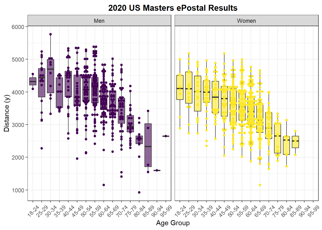
Not surprisingly younger athletes swam further on average than older athletes. It’s tempting to look at this data and conclude that as people get older their athletic performance declines. While that may be true we can’t infer any causal relationships here, because this is just observational data. Age related declines are one possible explanation, but there are others. For example, what if only the best athletes join USMS and participate in the ePostal when they’re in their teens and twenties? This hypothesis also matches with the data, because there are fewer athletes in the younger age groups, more in the older (at least to a point), and the top end performers in each age group perform about the same until the 60-64 age group. Perhaps as people age they return to swimming, or even start swimming without having swam before, thereby increasing participation numbers, but lowering the average distance swam by older age groups.
facet_labs <- c("Women", "Men")
names(facet_labs) <- c("W", "M")

df_2020 %>%
  group_by(Age_Group, Gender) %>%
  summarise(
    `Avg. Distance` = mean(Distance, na.rm = TRUE),
    `Top Distance` = max(Distance, na.rm = TRUE)) %>%
  pivot_longer(
    cols = c("Avg. Distance", "Top Distance"),
    names_to = "Distance Type",
    values_to = "Distance") %>%
  ggplot(aes(x = Age_Group, y = Distance, color = Gender)) +
  geom_point(aes(shape = `Distance Type`)) +
  geom_line(aes(group = `Distance Type`, linetype = `Distance Type`)) +
  theme_bw() +
  theme(axis.text.x  = element_text(angle = 45, vjust = 0.5)) +
  facet_wrap(. ~ Gender, labeller =  labeller(Gender = facet_labs)) +
  scale_fill_viridis(discrete = TRUE) +
  scale_color_viridis(discrete = TRUE) +
  guides(color = FALSE) +
  geom_hline(
    data = data.frame(yint = 5011, Gender = "W"),
    aes(yintercept = yint), alpha = 0.5, linetype = 2) +
  geom_hline(
    data = data.frame(yint = 5184, Gender = "M"),
    aes(yintercept = yint), alpha = 0.5, linetype = 2)
## `summarise()` has grouped output by 'Age_Group'. You can override using the `.groups` argument.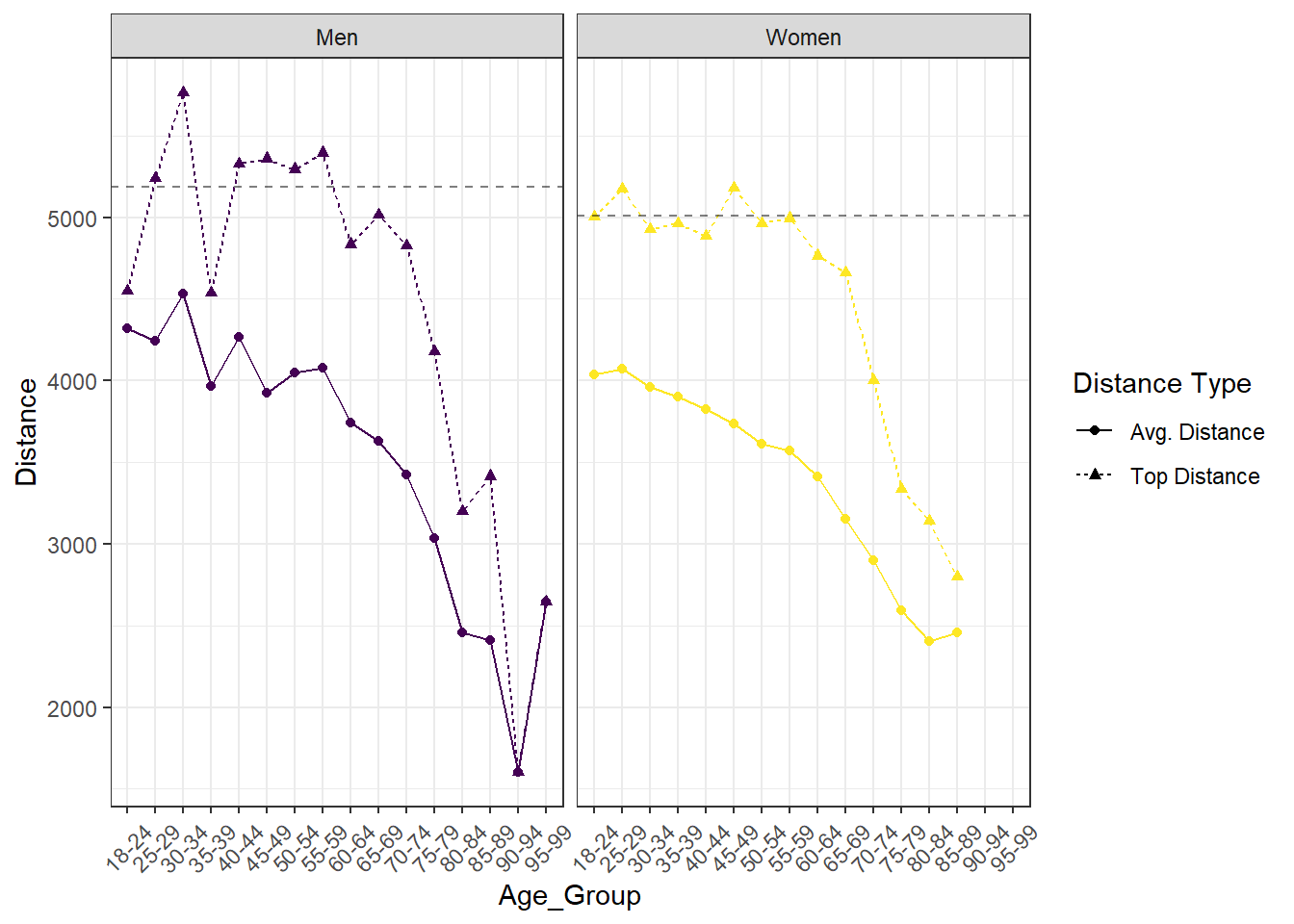
Join me in the next post where I’ll examine 1 Hour ePostal results over the last two decades.
Updated: 18 November, 2021
Created: 20 April, 2020